Website Navigation: Hamburger vs Main Header Navigation

The hamburger website navigation rose to popularity as quickly as it seems to be fading away. How does a website's navigation influence visitor behavior? We dived into our own site to share what happened.
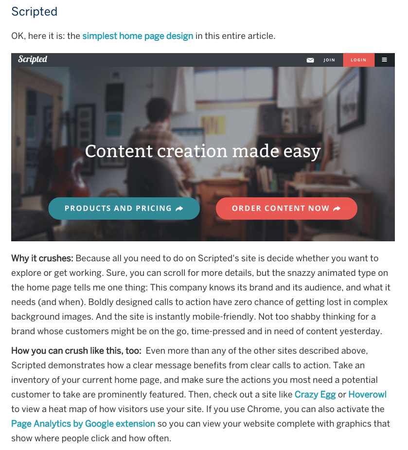
In April of 2014 we launched our new website with a hamburger menu (three horizontal lines to hide navigation). Our amazing design agency, Vital Design, encouraged us to embrace the trend and it made our homepage look very clean and simple. We agreed and we focused on the fact that most visitors who land on the homepage would scroll down to learn about our services. American Express even pointed out that Scripted's homepage was awesome because it was so simple.
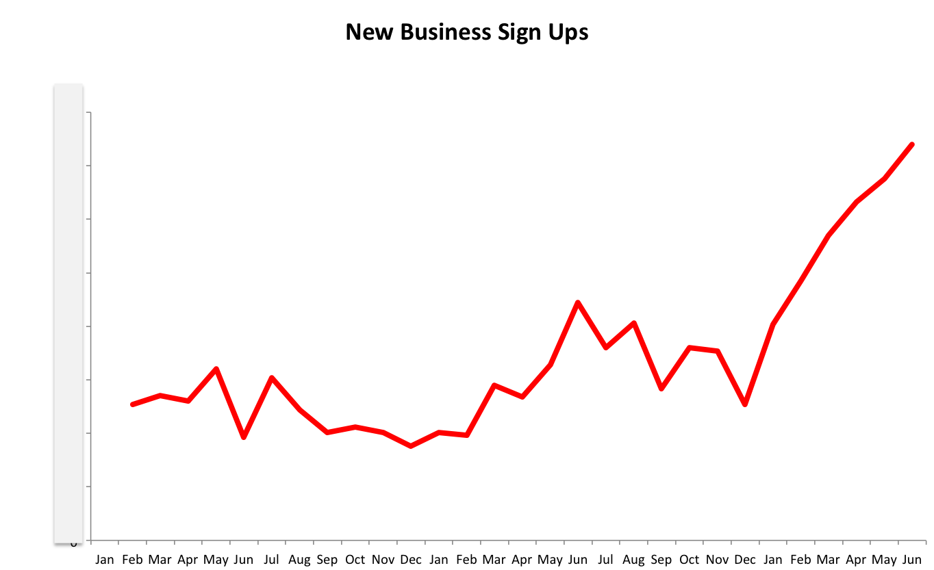
At first, it worked great. We were giving our visitors limited options on how they should engage with our website: learn more or get started right now. My main goal was to get visitors to register for Scripted (free sign up), and begin to order content within their dashboard. My second goal was for visitors to fill out a contact form to learn more about our services. Lastly, my third goal was to have our visitors engage with our resources, ebooks, and register for our webinars. We immediately saw an increase in new businesses signing up for our service:
We were happy with our performance as we were driving most visitors to our pricing page where you can find our different content formats, select the one you would like to order, and convert (sign up). However, as we began to add more services, resources, tools, and information for visitors, we needed a navigation structure that would support that. We built tools like a content planner - which is a great inbound lead source. We also launched a new topic marketplace product that allowed visitors to browse hundreds of blog post ideas by topic and order the blog post from our writers.
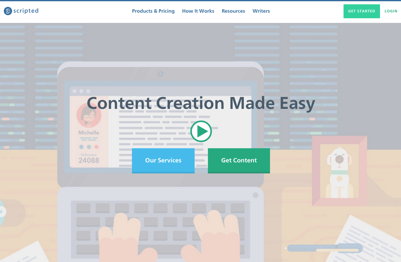
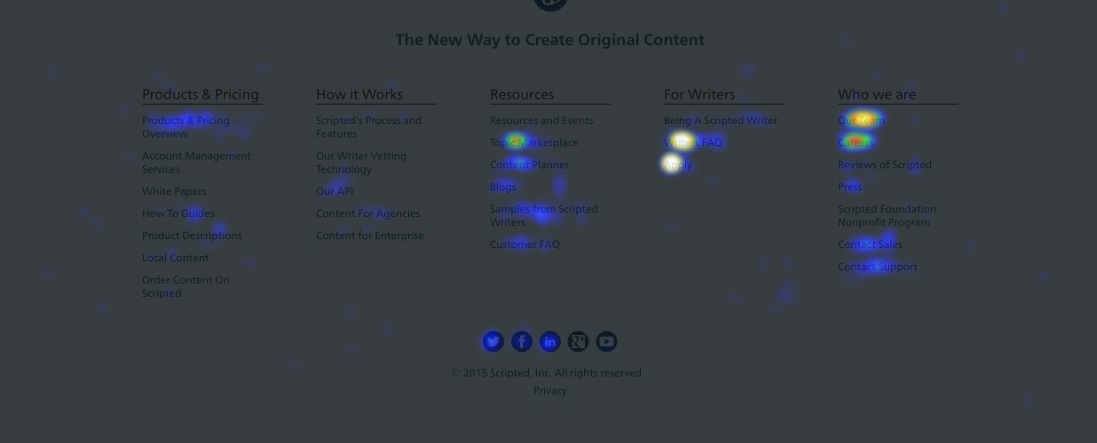
So, a few weeks ago we switched our main navigation to have our top pages at the top along with links to our resources and tools. Additionally we added a universal footer so visitors could find deeper level pages and links to our careers page.

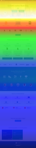
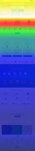
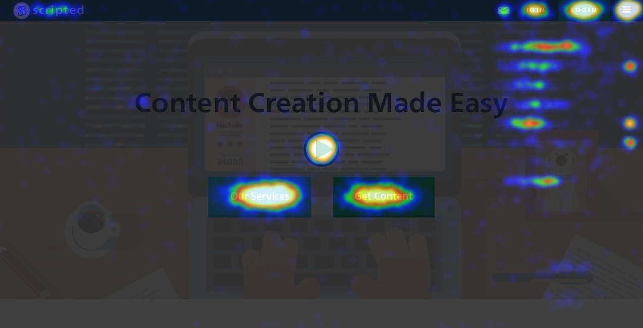
One thing that we didn't predict was how few visitors will scroll through your long homepage website. With various CTAs throughout the page, most visitors would click off to a deeper level page like our samples, writers, or case studies. As you can see with this heatmap, visitors would scroll - but the majority would not make it to the bottom. When we added our main navigation, even less visitors were scrolling down.
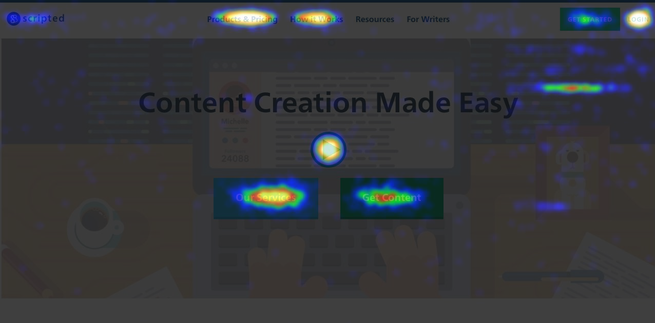
Compared to the heatmap that was first presented, most users are not making it past the 'How it Works' CTA in our "second swath." Before, 50% of users would make it to our 'third swath' which shows that we have content for all customer types. Whether or not this is a bad thing is debatable, but this means that because we have such a clear navigation, users can jump to other pages easier. Keep your scroll length in mind when creating a new website. Although a long scrolling page sounds ideal, remember that your visitors will abandon their scroll and move to other pages.
When you hide your navigation, click and heatmaps don't really show you a lot about user behavior. Unless you implement event tracking through Google Analytics on each button, you're not really getting a great idea of how visitors are getting to deeper level pages. With the main navigation - and especially our new footer - it's clear to see what's important to users and how they are clicking.
BEFORE:
AFTER:
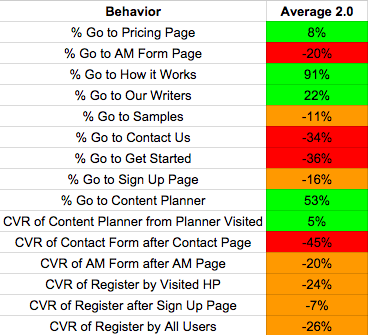
Given that our new goal was to allow visitors to explore deeper level pages easier, we've definitely accomplished that! In fact, we've increased the visits to our 'How it Works' page by 91%! Visits to our 'Content Planner' has increased by 53%!
If you have a larger website with different segments and sections for visitors, I would highly recommend using a main header navigation. If you have a smaller website with a simple call to action for your visitors, a hamburger navigation will be best. If you're a landing page for an app, or to play game, the hamburger makes sense. You don't need your visitors navigating everywhere on the website. Keep them focused on your primary CTAs.
With less options, visitors are given simple choices on how to navigate a website. With the only choice to either visit our pricing page or sign up, we were driving 38% more traffic to the "Get Started" CTA. That also led to a conversion rate that was 24% higher than when we had a main header navigation. Now, before we throw our hands up and revert back, we must also think about the quality of our registrations, not just the number. We could have a website with one page and the only possible action was to sign up. This would lead to a lot of registrations, but they would have limited knowledge to how we work and if we're the right solution for what they need. By allowing our visitors to access other parts of the website and really understand how we work, what our writing samples are, and other tools that we have available, those who do register are more qualified. It's still early in the results, but after our new navigation launch, we saw our active user rate jump by 106%. I don't imagine it will stay that way, but if we're getting 20% less registrations, but an increase of 40% in those who are ordering after registering, then I feel good about the change.
D Telepathy
http://www.dtelepathy.com/blog/design/hamburger-menu-examples
Squarespace
http://www.squarespace.com/
Wooshii
http://wooshii.com/
HLK
http://hlkagency.com/
What have you seen with your navigation? Are you a fan of the hamburger navigation? Comment below!
In April of 2014 we launched our new website with a hamburger menu (three horizontal lines to hide navigation). Our amazing design agency, Vital Design, encouraged us to embrace the trend and it made our homepage look very clean and simple. We agreed and we focused on the fact that most visitors who land on the homepage would scroll down to learn about our services. American Express even pointed out that Scripted's homepage was awesome because it was so simple.
At first, it worked great. We were giving our visitors limited options on how they should engage with our website: learn more or get started right now. My main goal was to get visitors to register for Scripted (free sign up), and begin to order content within their dashboard. My second goal was for visitors to fill out a contact form to learn more about our services. Lastly, my third goal was to have our visitors engage with our resources, ebooks, and register for our webinars. We immediately saw an increase in new businesses signing up for our service:
We were happy with our performance as we were driving most visitors to our pricing page where you can find our different content formats, select the one you would like to order, and convert (sign up). However, as we began to add more services, resources, tools, and information for visitors, we needed a navigation structure that would support that. We built tools like a content planner - which is a great inbound lead source. We also launched a new topic marketplace product that allowed visitors to browse hundreds of blog post ideas by topic and order the blog post from our writers.
So, a few weeks ago we switched our main navigation to have our top pages at the top along with links to our resources and tools. Additionally we added a universal footer so visitors could find deeper level pages and links to our careers page.
1. Main Header Navigation = Less Page Scrolling
One thing that we didn't predict was how few visitors will scroll through your long homepage website. With various CTAs throughout the page, most visitors would click off to a deeper level page like our samples, writers, or case studies. As you can see with this heatmap, visitors would scroll - but the majority would not make it to the bottom. When we added our main navigation, even less visitors were scrolling down.
Compared to the heatmap that was first presented, most users are not making it past the 'How it Works' CTA in our "second swath." Before, 50% of users would make it to our 'third swath' which shows that we have content for all customer types. Whether or not this is a bad thing is debatable, but this means that because we have such a clear navigation, users can jump to other pages easier. Keep your scroll length in mind when creating a new website. Although a long scrolling page sounds ideal, remember that your visitors will abandon their scroll and move to other pages.
2. Easier To See What Visitors Are Interested In
When you hide your navigation, click and heatmaps don't really show you a lot about user behavior. Unless you implement event tracking through Google Analytics on each button, you're not really getting a great idea of how visitors are getting to deeper level pages. With the main navigation - and especially our new footer - it's clear to see what's important to users and how they are clicking.
BEFORE:
AFTER:
3. Main Navigation = More Deeper Level Page Visits, But Lower CVR
Given that our new goal was to allow visitors to explore deeper level pages easier, we've definitely accomplished that! In fact, we've increased the visits to our 'How it Works' page by 91%! Visits to our 'Content Planner' has increased by 53%!
If you have a larger website with different segments and sections for visitors, I would highly recommend using a main header navigation. If you have a smaller website with a simple call to action for your visitors, a hamburger navigation will be best. If you're a landing page for an app, or to play game, the hamburger makes sense. You don't need your visitors navigating everywhere on the website. Keep them focused on your primary CTAs.
4. Hamburger = Better CVR, But Less Qualified Converters
With less options, visitors are given simple choices on how to navigate a website. With the only choice to either visit our pricing page or sign up, we were driving 38% more traffic to the "Get Started" CTA. That also led to a conversion rate that was 24% higher than when we had a main header navigation. Now, before we throw our hands up and revert back, we must also think about the quality of our registrations, not just the number. We could have a website with one page and the only possible action was to sign up. This would lead to a lot of registrations, but they would have limited knowledge to how we work and if we're the right solution for what they need. By allowing our visitors to access other parts of the website and really understand how we work, what our writing samples are, and other tools that we have available, those who do register are more qualified. It's still early in the results, but after our new navigation launch, we saw our active user rate jump by 106%. I don't imagine it will stay that way, but if we're getting 20% less registrations, but an increase of 40% in those who are ordering after registering, then I feel good about the change.
Other great examples of navigation:
D Telepathy
http://www.dtelepathy.com/blog/design/hamburger-menu-examples
Squarespace
http://www.squarespace.com/
Wooshii
http://wooshii.com/
HLK
http://hlkagency.com/
What have you seen with your navigation? Are you a fan of the hamburger navigation? Comment below!